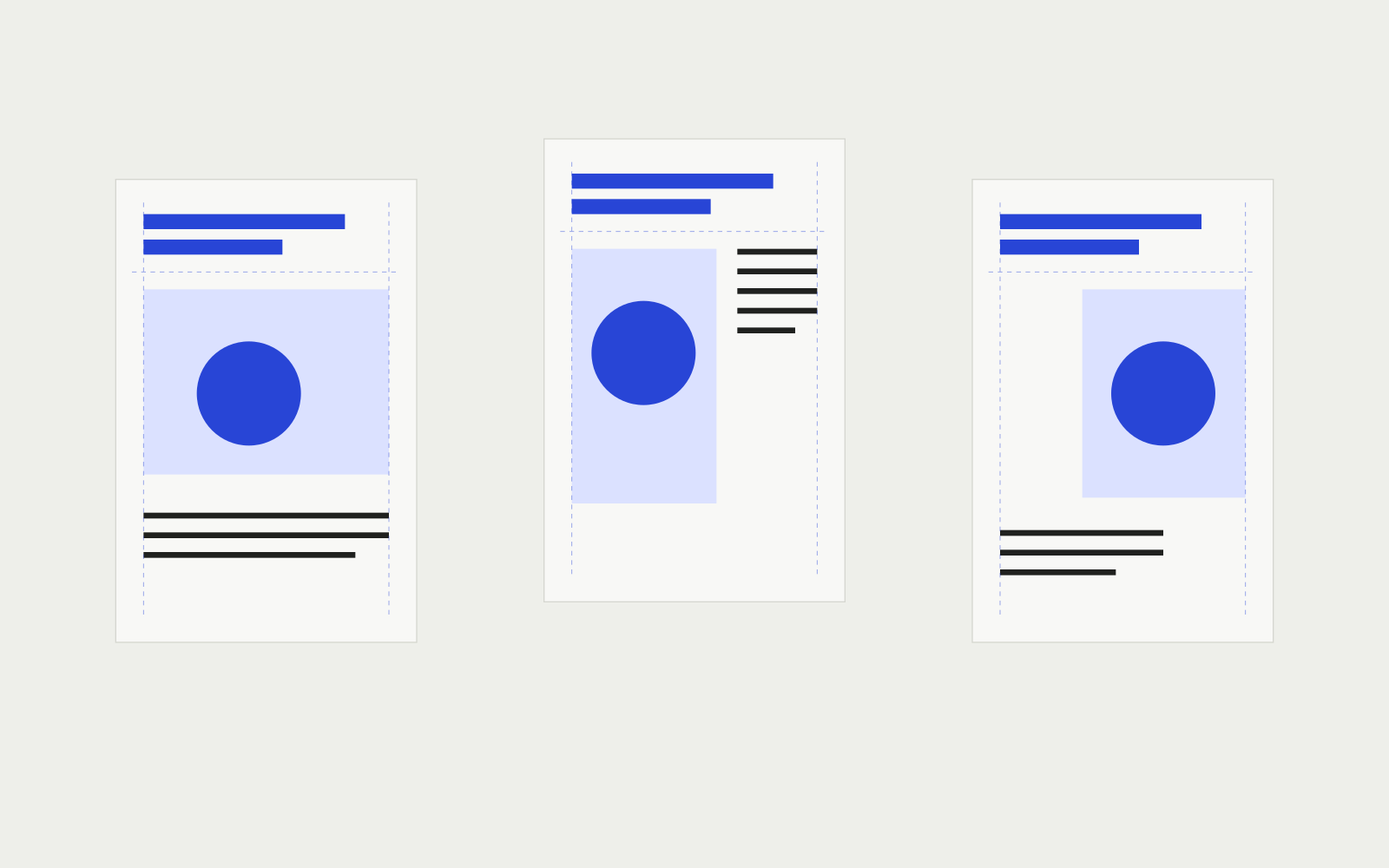
A heading at the top, an image below, a few lines of text. The page seems settled. Then the text moves alongside the image: now it looks at it from outside, almost like a note. Change a single distance and the same elements begin speaking to one another differently.
I built three versions of this small page to make that shift visible. A layout grid establishes alignments, columns and intervals within which to place content. It helps hold together decisions that could contradict one another if made separately. How much room to give the image, though, remains a choice.
Before the lines, the content
The material in the comparison below is deliberately sparse: a heading, a geometric drawing, a caption and a paragraph. I kept the words and typeface the same. What changes is the space available to each element and its position relative to the others.
The first decision concerns the relationship between image and text. Should we encounter them one after the other? Should we be able to look at them together? If the image were a document to examine closely, its size would carry a different weight than a mark used only to give the page rhythm.
Drawing columns before clarifying that relationship can produce an impeccable but unhelpful structure. The content ends up in the spaces left over. In this study I followed the opposite route: a few recognisable elements, then three ways to relate them.
Try changing the page
Switch between versions. First observe where the heading lands, then look at the text’s left edge. “Show the grid” reveals the alignment references. The horizontal lines provide a way to compare spacing, not a promise that every line of text will sit on them.
Adjust spacing and colour
One column. Heading, image and text follow one another along the same axis.
The place
of things

There are only a few shapes. The space between them is enough to suggest a group, a distance, an expectation. To change the page’s balance, we can start with what separates them.
Two columns. The image has more space; the text stays beside it in a narrower column.
The place
of things
There are only a few shapes. The space between them is enough to suggest a group, a distance, an expectation. To change the page’s balance, we can start with what separates them.
Modules. The image occupies four modules. Heading and text share the left margin.
The place
of things
There are only a few shapes. The space between them is enough to suggest a group, a distance, an expectation. To change the page’s balance, we can start with what separates them.
In the single column, the proposed route is sequential: the heading announces, the image takes the centre and the text follows below. The elements share their margins. This gives the image generous width and makes the document’s order clear, but requires more vertical space.
In the two asymmetric columns, text sits beside the image. The narrower column creates more line breaks: the paragraph occupies a tall, thin band. The change is especially visible on a phone. Even a few words demand attention when the line length becomes short.
The modular version divides the width into three parts. The image occupies two and shifts to the right; the text starts again from the left margin. The empty space below the heading becomes noticeable. Here it separates the announcement from the image, but comes at a cost: the page grows longer and the image–paragraph relationship becomes less immediate.
These are readings of three compositions, not findings from a reader study. To know where a person actually looks, we would need to observe them. For now, the comparison lets us discuss specific decisions rather than stop at “this one is cleaner”.
Alignment suggests a relationship
Two elements starting on the same axis offer a shared reference. In the first example, heading and paragraph share an origin: the page holds them together even at a distance. In the third, the image departs from that axis; reaching it requires a sideways step.
Intervals matter as much as lines. A caption close to an image says what it belongs to. Move it away and closer to the next paragraph and that relationship becomes less clear. A grid supplies reusable measurements for these distances, but cannot distinguish a caption from a marginal note. We need to know the difference.
Josef Müller-Brockmann’s Grid systems in graphic design is a historical reference for this organisational work. The Niggli publisher’s record presents systems applicable to projects at very different scales. The compositions on this page are new: they examine a small problem without reproducing the book’s examples.
What the grid leaves open
The same structure can hold a quiet heading or a huge one. It can contain an image spanning several columns or a small figure surrounded by white space. Counting columns therefore tells us little about the final result: we need to see how they are occupied.
For this study’s content, I would choose the single column. The drawing is simple, the text is short and there is no need to compare data side by side. The second version would become more interesting if the paragraph commented on specific parts of the image. The third could give rhythm to a series of pages, provided the empty space also had a recognisable function on subsequent pages.
The choice changes with the content. Adding a wide table or a long caption would require us to rework the structure. A useful grid withstands real variations; working with the first test text is not enough.
The page continues beyond the sheet
On the web, another order must be preserved: the document’s. A visual arrangement can move an element right or up without changing its position for someone using assistive technology. The W3C CSS Grid specification makes precisely this distinction between visual and content order.
In the comparison, heading, image with caption and paragraph keep the same document sequence. Without JavaScript, all three versions can be read. On a small screen, the columns remain comparable: narrow text is part of the problem being shown, not a model for a long article.
Before adopting a grid, I would therefore check the page with its most awkward material: the long heading, the vertical photograph, the note that will not fit. That is where measurements stop being a drawing of lines and become decisions to justify.
References and credits
- Josef Müller-Brockmann, Grid systems in graphic design, Niggli, 1981. Bibliographic reference; no plates from the book are reproduced.
- W3C, CSS Grid Layout, Reordering and Accessibility, on the distinction between visual arrangement and document order.
The cover, drawing and three layouts are original compositions for the Notebook. To follow another transformation of the same image, continue with Images do not stand still.