Someone sends a photograph in a chat. Someone else saves it, trims the edge and posts it elsewhere. We come across it a few days later: it is smaller, has some text on it and may have lost the photographer’s name. We recognise it. But are we still looking at the same image?
The answer depends on what we consider part of the image. If we look only at the picture, we might think so. If we include the words accompanying it, where it appears and the possibility of tracing its source, something has changed. Its journey has become part of its meaning.
I want to start with these ordinary steps. Cropping and forwarding are so easy that we risk treating them as transparent acts. Yet each decides what remains visible and what disappears.
The edge is already a choice
A photograph has an inside and an outside. At the moment of exposure, something enters the frame and everything else stays out. Even an edge we find ready-made on a screen can move: pinch with two fingers, choose a format, save a crop.
For me, the edge already takes a position. It tells us where to look and, in the same gesture, spares us the sight of everything else. On a screen that decision feels provisional: we can zoom, scroll or open another window. Yet each new view still leaves something out. Anna Caterina Dalmasso’s essay Il bordo opaco. Pensare lo schermo, pensare la superficie helps question this relationship between the surface that shows and the boundary that separates.
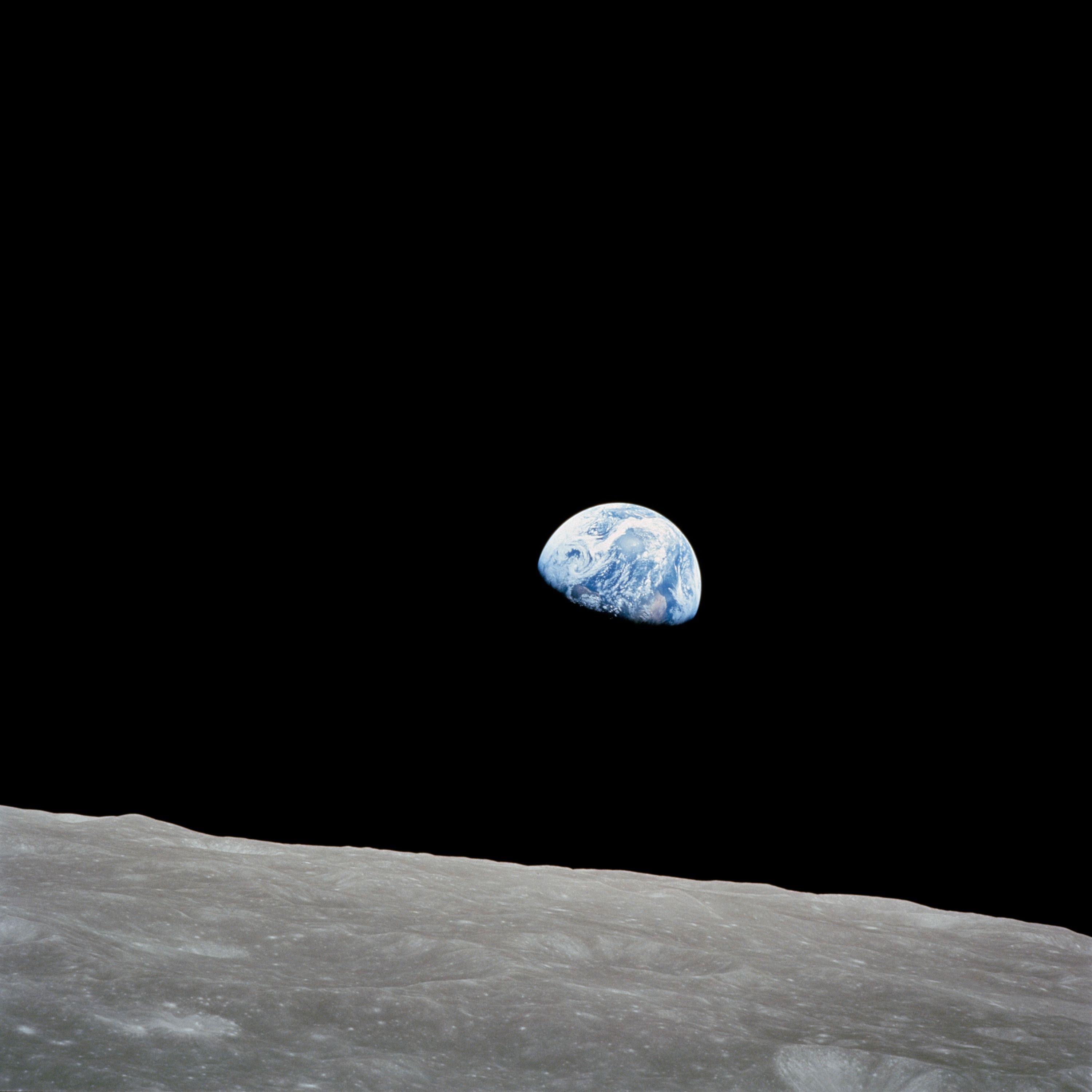
Take Earthrise, Bill Anders’s photograph of Earth above the lunar horizon, taken during Apollo 8 on 24 December 1968. The NASA record lets us verify its author and date. We see two worlds together: nearby grey ground and a distant blue planet. If we remove the lunar surface, Earth remains recognisable. But we lose the place from which we are looking at it.
- Archive
- Crop
- New post
An image with its history
Earthrise. Bill Anders, Apollo 8, 24 December 1968. Source: NASA.
The photograph remains linked to an author, a mission, a date and an accessible source.
The edge changes the story
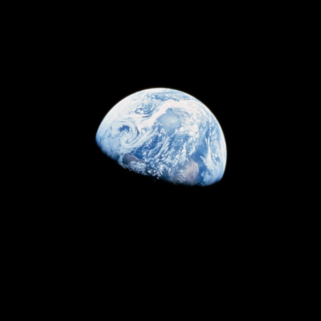
Earth, isolated in the dark.
The crop hides the lunar surface. The photograph is the same, but the relationship between the two bodies disappears.
Words take the place of the source
A small world, all for us.
The caption was invented for this demonstration. The photograph is not falsified, but author, date and provenance disappear from the message.
Cropping can be useful. It isolates a detail, fits a photograph to a page or draws attention to something we might otherwise miss. The problem begins when we forget it is a choice: what seems absent may simply have stayed outside the new edge.
A copy does not necessarily lose quality
Before going on, it is worth clearing up a misunderstanding. Copying a file without modifying it does not wear away its pixels. An identical copy retains the same data. Digital files allow precisely this: duplication that does not, by itself, introduce deterioration.
Differences arise when the file is transformed. Reducing an image from 1200 to 96 pixels per side removes detail; re-encoding it with lossy compression can introduce further artefacts. The JPEG format includes several coding methods; here we use the common lossy one. A new save can therefore change the data describing the image instead of merely copying it.
In the comparison below, the photograph appears at the same size but comes from two different files. Look at Earth’s edge and the lunar surface: the overall shapes hold up better than shading and detail.

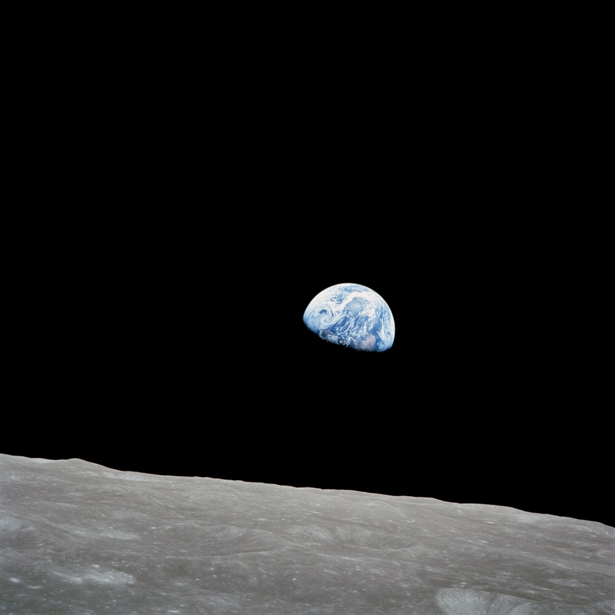
Move the slider or use the arrow keys. More detail is revealed on the right.
The small file is much lighter. It may be easier to send or display over a limited connection. But there is no fixed relationship between lightness and usefulness: a few details suffice to recognise Earth; to study a surface, those details may be the photograph’s purpose.
The useful question becomes: what must the recipient be able to see? The right file for a preview is not necessarily the right one for an archive or a print.
The poor image has a social life
In In Defense of the Poor Image, published in 2009, Hito Steyerl shifts attention from image quality to the conditions of circulation. Degraded copies can bring back works excluded from normal distribution channels and reach audiences who would otherwise never encounter them.
From this perspective, loss of definition is intertwined with access. It guarantees no freedom: Steyerl’s text also includes appropriation, exploitation and conformity within circulation. A copy can open a path and lose its credits along the same journey.
I take a criterion for this article from that: do not judge a copy only by its sharpness. Asking who can encounter it, under what conditions and with what information is another way to assess it. This does not make every deterioration desirable; it makes technical judgement alone insufficient.
The caption travels less readily than the pixels
Imagine two visually identical files. The first comes with author, date and an archive link. The second carries an evocative phrase and nothing else. The resolution has not changed, but the reader has lost the means to verify what they see.
This is a different loss from the one shown in the comparison. It does not appear as a block or a blur. It emerges when we try to answer basic questions: where was this photograph taken? When? By whom? Did the phrase accompanying it belong to its first publication?
Being able to share a photograph does not mean controlling its route. We can preserve a source in our archive and lose the connection in the very first screenshot. Whoever receives the copy inherits our crop, our words and our omissions. It is a small editorial responsibility, even when we do not consider ourselves editors.
That is why I treat the caption as part of the design. A name and a link will not prevent every misuse, but they leave a route open. The photograph can keep travelling without making each new reader reconstruct its history from scratch.
A credible image may have no camera exposure
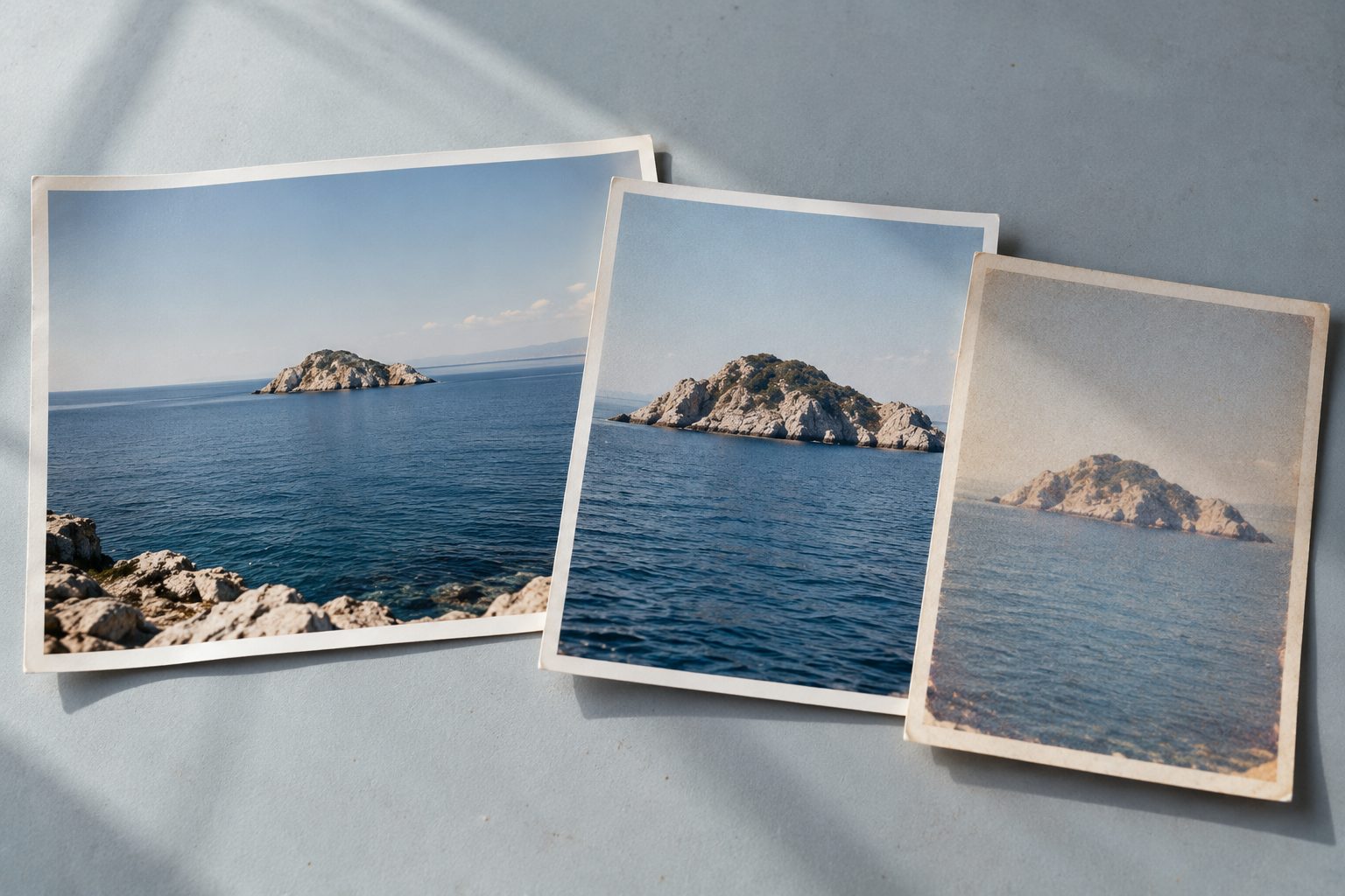
This article’s cover also needs a caption. It shows photographic prints of a seascape on a table. It looks like documentation of existing objects, but it was generated with imagegen for this page: neither table nor prints were photographed.
I used it to illustrate the subject. It documents no particular coast and does not prove those copies ever changed hands. If extracted from the page, its photographic appearance could outlast the explanation of its origin. The question of context would return before we even discussed pixel quality.
The NASA photograph and generated cover can belong in the same article, provided we make clear what we ask of each. The first points to an exposure and an archive; the second stages an idea. A caption makes this difference legible.
When preparing an image for a page, I therefore want to preserve two possibilities: seeing it clearly and tracing what we know about its origin. Definition serves the first. For the second, we need to leave a few traces outside the edge.
References and credits
- Hito Steyerl, In Defense of the Poor Image, e-flux journal, no. 10, November 2009.
- Anna Caterina Dalmasso, Il bordo opaco. Pensare lo schermo, pensare la superficie, Rivista di estetica, 55, 2014, pp. 53–70.
- NASA / Bill Anders, Earthrise, 24 December 1968. Reduced versions and crops were made for this article under the NASA guidelines for editorial image use.
- JPEG, Overview of JPEG 1, the technical reference for distinguishing copying from encoding.
The cover is an illustration generated with imagegen. The experiments are demonstrations: they do not measure the behaviour of messaging services or social networks.