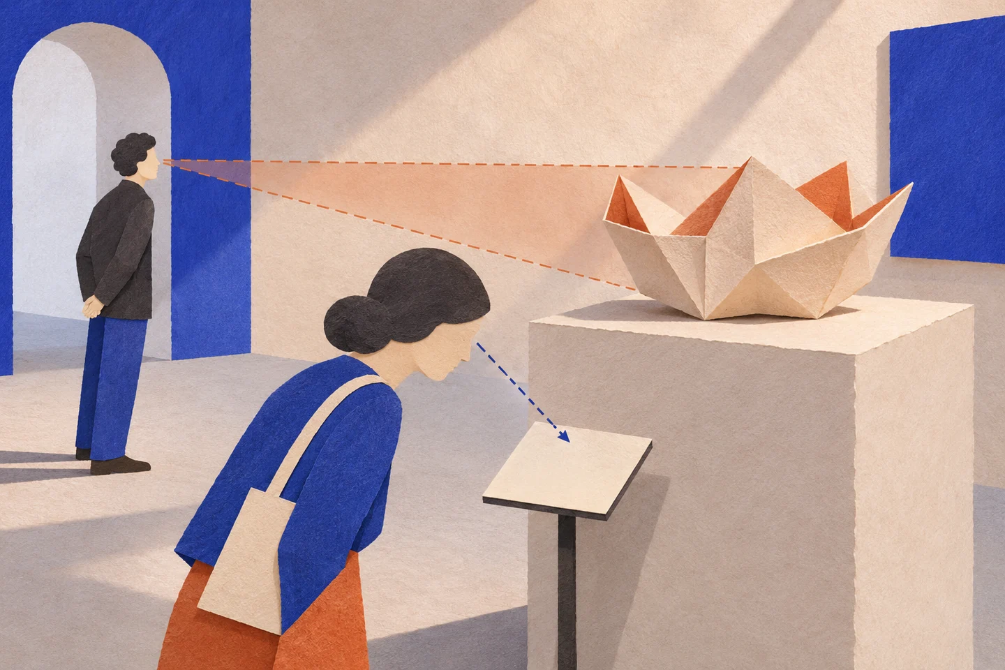
A text may be short and still difficult to encounter. It sits too low, is hidden by someone looking at the object, or requires approaching a cramped spot. The label seems resolved inside the file, but the visitor still needs to find a place from which to read it.
That is why I consider a label together with its position. Word count matters, but it does not replace the relationship between body, object and written surface. Even an impeccable line needs light, distance and a real opportunity to pause.
Information to reach
I prepared a label for an imaginary object called “Stone with a Hole”. The comparison keeps the content and changes the hierarchy between name, brief orientation and detail. It is a digital sample: it assigns the object to no real collection and documents no printed reading trial.
The same label, two hierarchies
Stone with a Hole
An opening changes how we look at the surface.
An imaginary object for the sample. No real collection.
Stone with a Hole
An opening changes how we look at the surface.
An imaginary object for the sample. No real collection.
The label section of the Smithsonian guidelines connects legibility and access to alternative formats. Here I use the sample to discuss hierarchy; physical testing remains to be done.
The first level should help people understand whether and why to stop. A very large name does not always do this. If it only says what the object already shows, a short orienting sentence may offer a better reason to approach.
Preserving an entrance into the text
In the sample, detail remains available without taking the same position as the initial orientation. Hierarchy allows different timings: a glance, a short reading, closer study. It does not presume that longer attention means better understanding, or that everyone can freely choose the same distance.
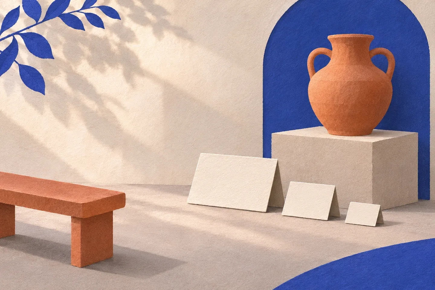
On site, I would also look for what a screen cannot reproduce. A reflection can erase contrast, another person can hide the label and a fixed position can exclude someone viewing from a seat. These conditions need checking in the installation, rather than being made certain through a convincing mockup.
Type size in the file is a design specification. Actual legibility depends on support, lighting, distance and people. This page’s responsive screen display resizes the sample: it should not be used as a ruler to derive physical dimensions.
The text accompanying the object
The two AI-generated illustrations show an imaginary exhibition model with different viewing positions. They are not photographs of a museum or ergonomic tests. Their role is to put the label back into the space left outside the typographic sample.
Even the simplest sentence chooses a viewpoint. It may guide attention towards a detail, provide context or bring a question into focus. If it tells everything before the object has been looked at, it risks replacing the object with its own reading. If it offers no entrance, it can leave the reader facing a name they do not know how to use.
A caption accompanies when it lets us return to the object with a more precise question. The page helps prepare this relationship. The place from which to read it remains part of the design, still to be tested standing and seated.