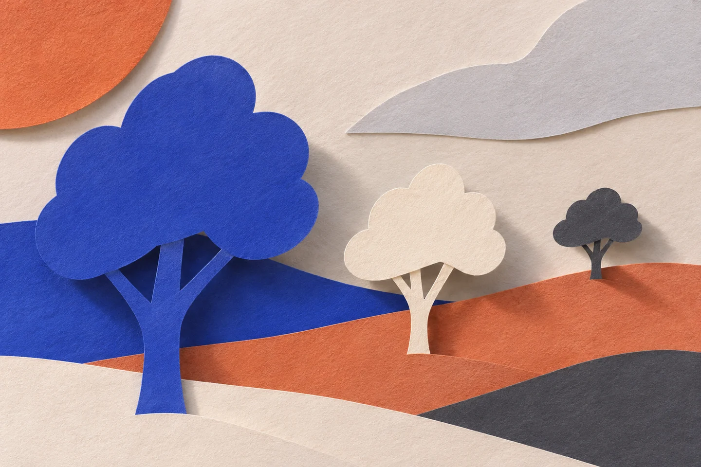
Two rectangles occupy the same sheet. One need only interrupt the other’s edge to appear in front. The page is still flat, but reading has already constructed an order: something covers, something continues behind. Part of what we see comes from that missing line.
There is no need to simulate a complete room to observe this passage. I built three small drawings, each devoted to a cue: overlap, a difference in scale and converging lines. They are new diagrams, separated so that the work done by each choice can be examined.
An interrupted edge
In the first drawing, two shapes have the same dimensions. The uninterrupted outline belongs to the figure in front; the other is broken. Switching the order changes which shape seems to cover the other without altering their size. The relationship depends on how the edges are composed.
Three depth cues
OpenStax’s section on vision includes overlap, relative size and linear perspective among depth cues. Here I use them to discuss three graphic choices, without measuring the reader’s perception.
Hiding a part can suggest the space in which that part continues. The effect does require a figure that remains recognisable when incomplete. An overly ambiguous cut may look like a break in the mark rather than another object passing in front of it.
The distance we assign to size
In the second drawing, similar silhouettes change size. This makes a depth reading available: the small one may seem further away. It is not the only possible explanation. It might depict a smaller object, or a hierarchy of importance within a symbolic composition.
This is a useful limit when working on a page. Enlarging an element can bring it nearer, make it dominant or indicate its weight in the argument. Those three readings differ. The composition needs to clarify which relationship matters through context and its connection with other marks.
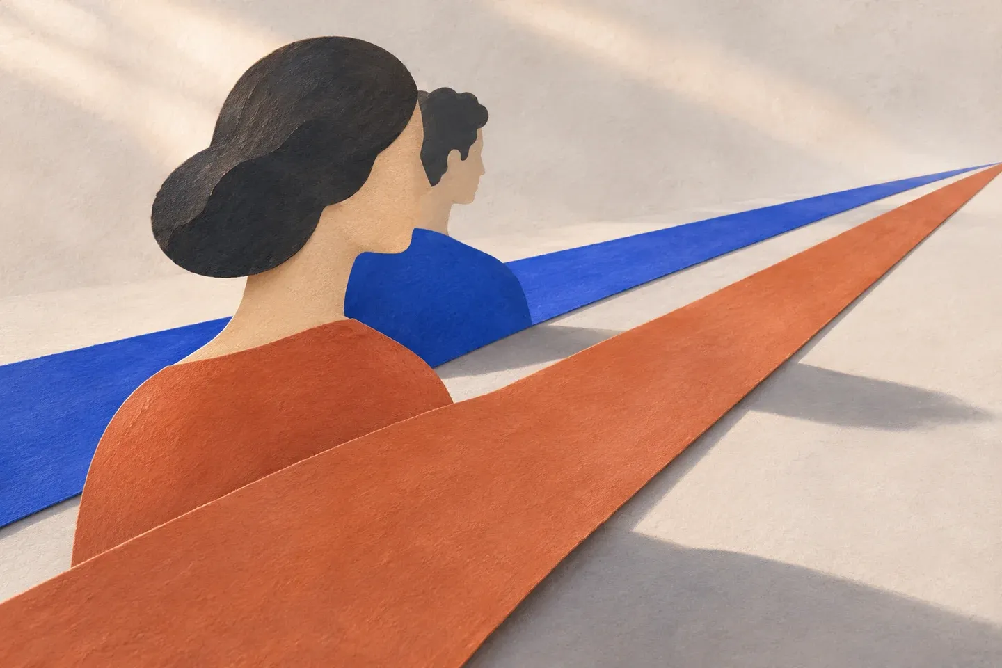
In the third diagram, two lines approach a point. The surface suggests a path receding into the distance. But I am not reconstructing a measured road: convergence is a drawing choice, and the figure contains no data from which to derive real distances.
When cues contradict each other
A small figure can cover a large one. A perspective line can lead towards an object that keeps the same size. Such conflicts may confuse a reading or become the reason to stop and look. Constructed depth carries no obligation to realism.
The two AI-generated illustrations show paper sheets and cut-out silhouettes, making the tension between plane and distance visible. The diagrams retain control over geometry instead. Neither kind of image documents an experiment with people.
A page’s depth also proposes an order of things. Deciding what covers, what recedes and where the margins converge suggests a place from which the reader can look. That place is already part of the design, even while the sheet stays still.