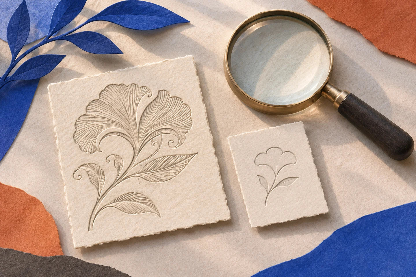
The mark looks complete while it stays large. Its openings are clear, the inner curve has a rhythm of its own, and a small interruption keeps the figure from closing. Then it has to sit beside an address in the browser. The interruption almost disappears. Work that seemed finished opens up again in a tiny space.
A reduction preserves the drawing’s proportions but changes the conditions in which we must recognise it. Geometric fidelity can produce a result that is less faithful to its intention. A gap designed to separate two parts becomes a blur; an accent that gave direction merges with the edge.
The form that needs to remain
For this page I built an abstract mark unrelated to the MAVID logo: an interrupted ring with an internal cut. I show it at 16, 24 and 64 CSS pixels. These are document dimensions; its physical size on screen depends on the device and zoom. The thumb in the title suggests a condition of use, rather than a measurement taken from the monitor.
The comparison places a proportional reduction beside a version with a wider opening. The aim is not to choose a winner for every setting. I want to see which relationship disappears first and which adjustment makes it distinguishable again. A more compact mark may be preferable, provided its compactness is a choice rather than an export accident.
One mark, two versions
Proportional reduction
Wider opening
The small version needs to preserve a hierarchy, even when it gives up a detail. Here the priority is the interruption in the ring. If it disappears, the way the figure’s parts hold together changes. The secondary cut can be sacrificed without losing that structure.
Making room for the gap
It is easy to work only on solid shapes: thicken a line, darken a surface, increase contrast. But two heavier strokes may compress the very space that separates them. In the optical version I therefore treat the gap as part of the drawing. Its width needs to be considered alongside the marks that define it.
Apple’s guidance on app icons notes that an icon appears in different system contexts. Here I keep a narrower problem in view: the relationship between a mark’s size and the legibility of its parts.
An app icon and a logo have functions that may overlap without being identical. The frame imposed by an operating system, the background and neighbouring marks all affect how an icon is read. Bringing a logo into that frame needs another check; filling as much of it as possible is not enough.
Resemblance and identity
Optical correction involves a real risk: while trying to preserve the mark’s character, I may change it too much. If every size gets an independent drawing, the family loses continuity. I need to establish what can vary and what holds its identity: a direction, a relationship between solid areas, a particular way of interrupting the figure.
I prefer to compare distant sizes as well, rather than enlarging the small one until the defect seems solved. Enlargement helps with editing; the size in use helps with judgement. Confusing them means refining a drawing the reader will never encounter in that form.
A limited family
There is no need to prepare a version for every possible pixel size. This example needs only two behaviours: the extended drawing and the one intended for tighter spaces. A threshold would then have to be chosen within the actual system, looking at real exports and backgrounds. This page does not certify a universal threshold or collect recognition tests with other people.
Even a vector file needs attention. It can preserve an edge precisely, but scalable curves do not automatically restore the space missing from a slit. The geometry can be impeccable while the visual relationship remains fragile.
The detail to give up
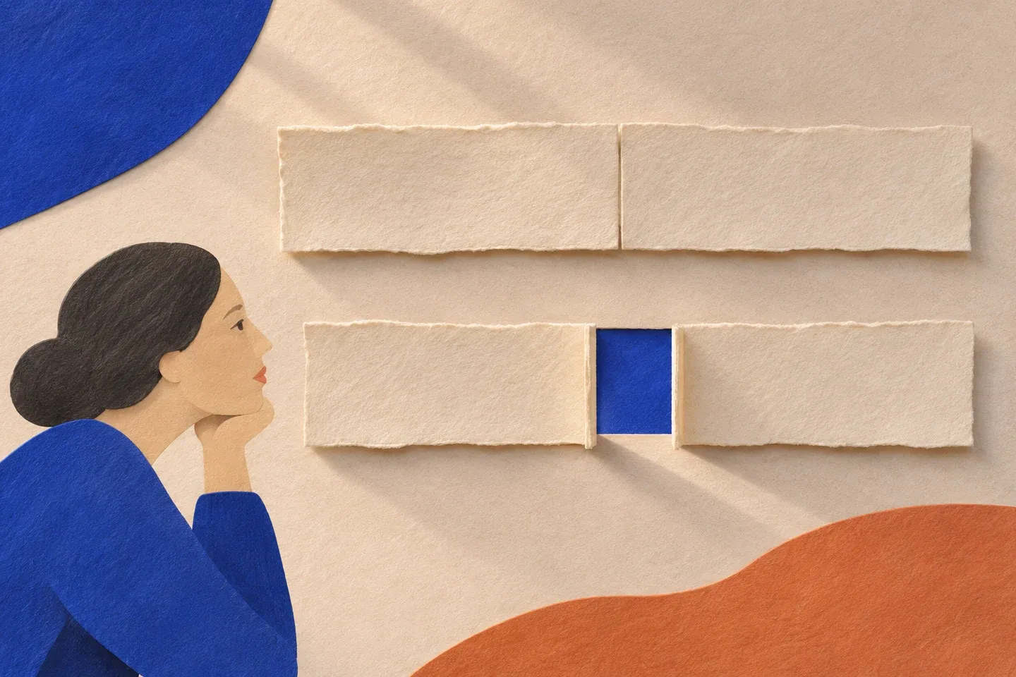
The illustrations accompany the shift from an elaborate figure to its essential opening. They are AI-generated images, not photographs of printed marks or resolution tests. The measurable comparison remains the one built into the page.
Reducing a mark means choosing what it can lose without ceasing to be itself. The enlarged opening embodies that decision. At a large size it may look almost excessive; at a small one it restores the figure’s ability to remain open.