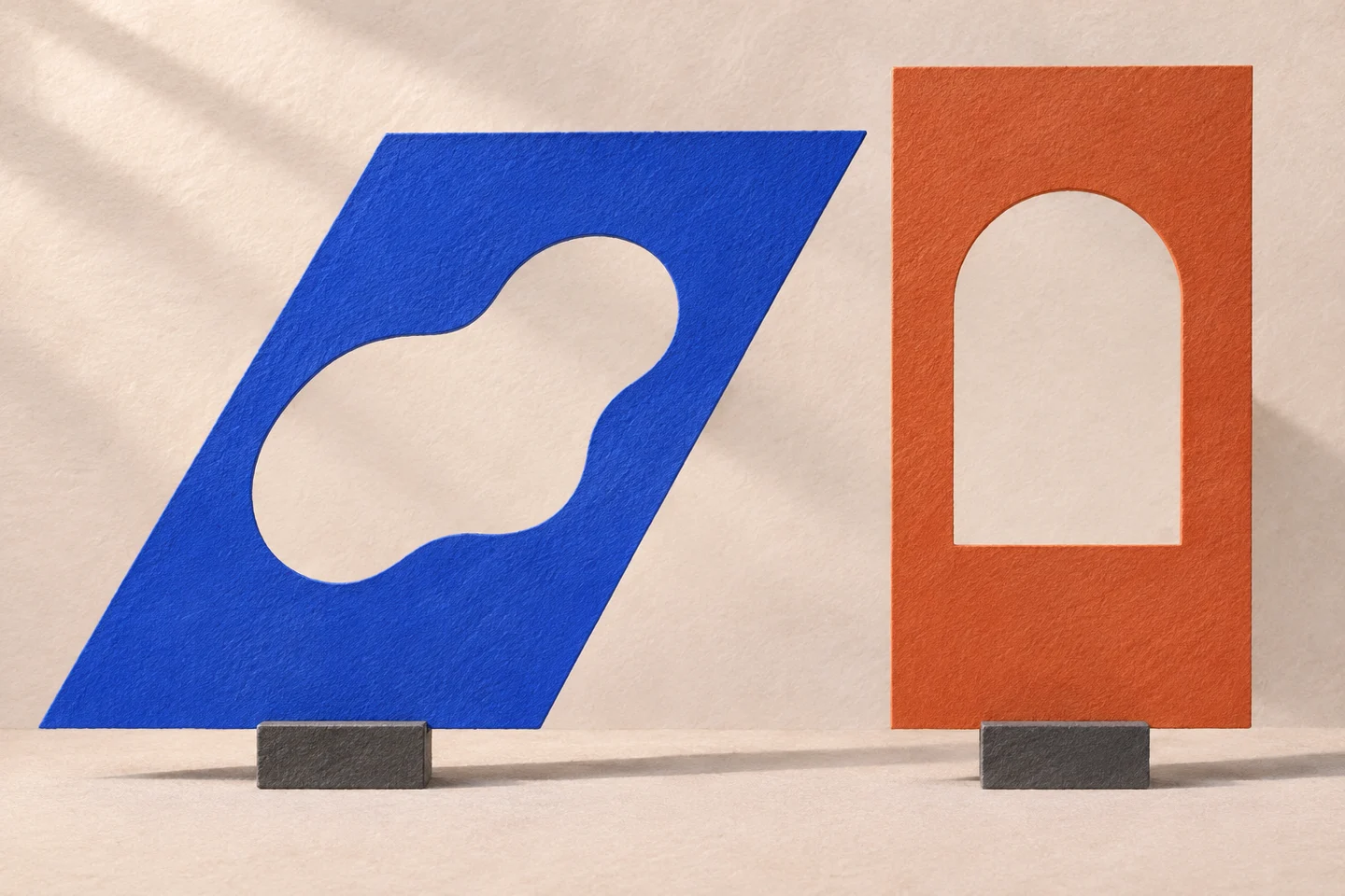
An inclined area remains between A and V. Between two Hs, the gap has a different shape. We can give the letters the same advance and still read distances that do not seem alike. A number preserves one relationship between positions; the shape’s contour builds another.
The temptation is to correct whichever space looks wider immediately. First it helps to clarify what we are moving. The distance between characters’ starting positions, the white area between strokes and a word’s rhythm are different things, even if everyday language calls all of them spacing.
One typeface and two pairs
The sample uses IBM Plex Mono, the site’s typeface, with AV and HH pairs. The Plex project documentation remains the source for the typeface and its licence. The forms are not redrawn to produce a more obvious effect.
Two pairs in the same typeface
AV
HH
A control changes the added spacing between letters in both pairs. The initial value is zero, and reset returns to it. The example does not alter the font’s kerning tables or turn a monospaced typeface into a proportional one: it applies an explicit adjustment to text in the document.
Numerically regular spacing can produce an irregular visual rhythm. Diagonal and vertical strokes define different white areas. Judging rhythm therefore means looking at the shapes together, rather than treating the gap as a measurement independent of its surroundings.
Moving closer does not solve everything
Reducing spacing can make a pair more compact. It can also make the characters seem too closely joined, creating a new form I did not seek. Where this happens depends on the typeface, size and word in which the pair will appear.
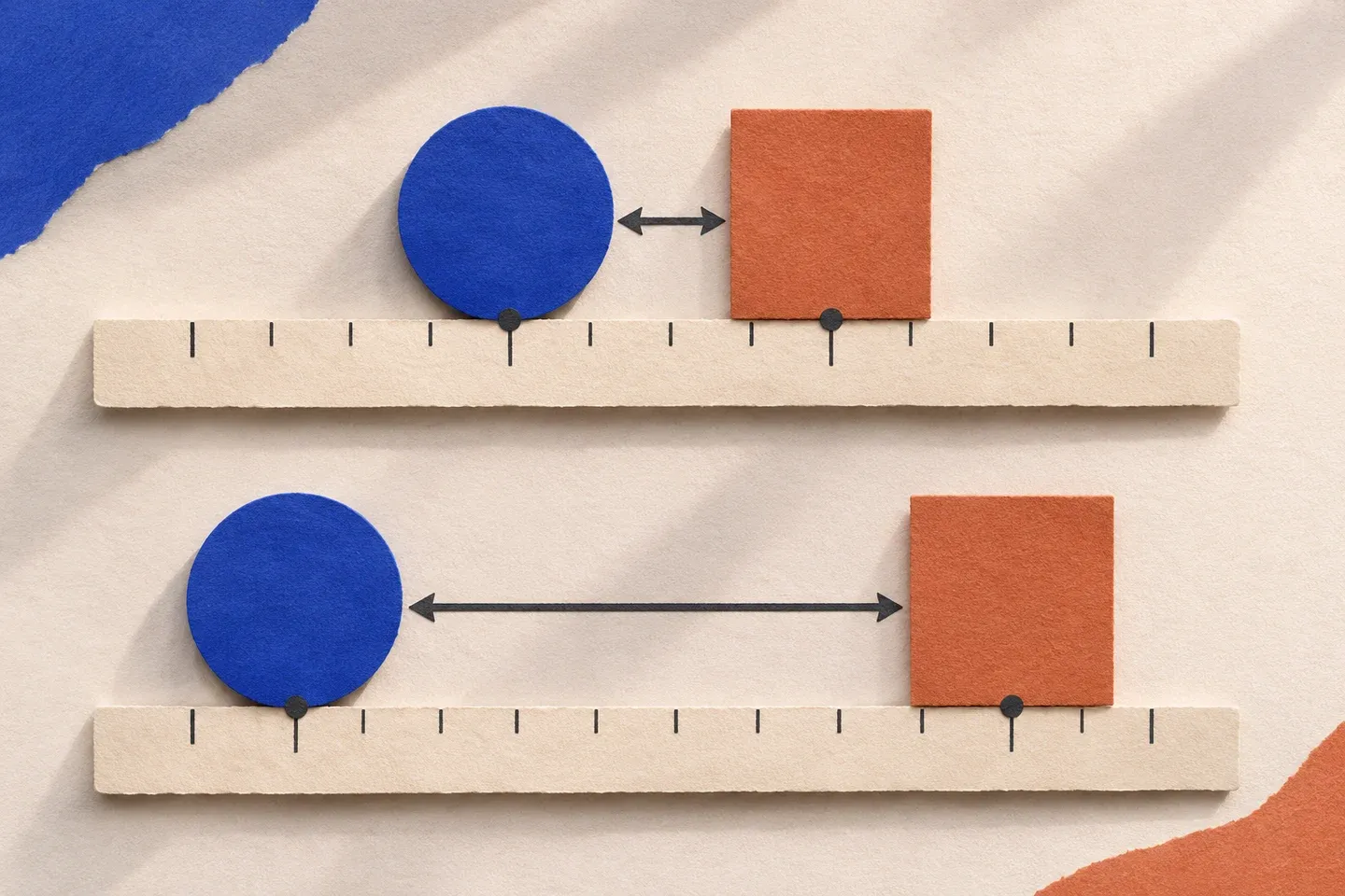
That is why I would not finish the work on two enlarged letters alone. A convincing correction in detail can create an overly strong accent within an ordinary word. The close sample helps identify a problem; the complete line helps establish whether the intervention belongs to its rhythm.
Both pairs change together in the comparison while type size remains fixed. I collect no preferences and derive no optimal value for every font. The readable figure is only the space added in the document, to be compared with what each reader observes on their screen.
The white that belongs to the form
The two AI-generated illustrations use diagonal and vertical silhouettes. They contain no measurable glyphs and do not represent scans of the font’s letters. They help separate geometric support from the gap perceived between contours.
When I return to a word, I therefore look for a balance that does not depend on abstractly equal distances everywhere. Some pairs may need a local adjustment; others work within the typeface’s advance. The technical ability to adjust does not oblige us to correct every difference an enlarged view can reveal.
Spacing is judged in the relationship between letters that must continue to be read together. The gap has a shape, but it should not become the word’s unintended protagonist.