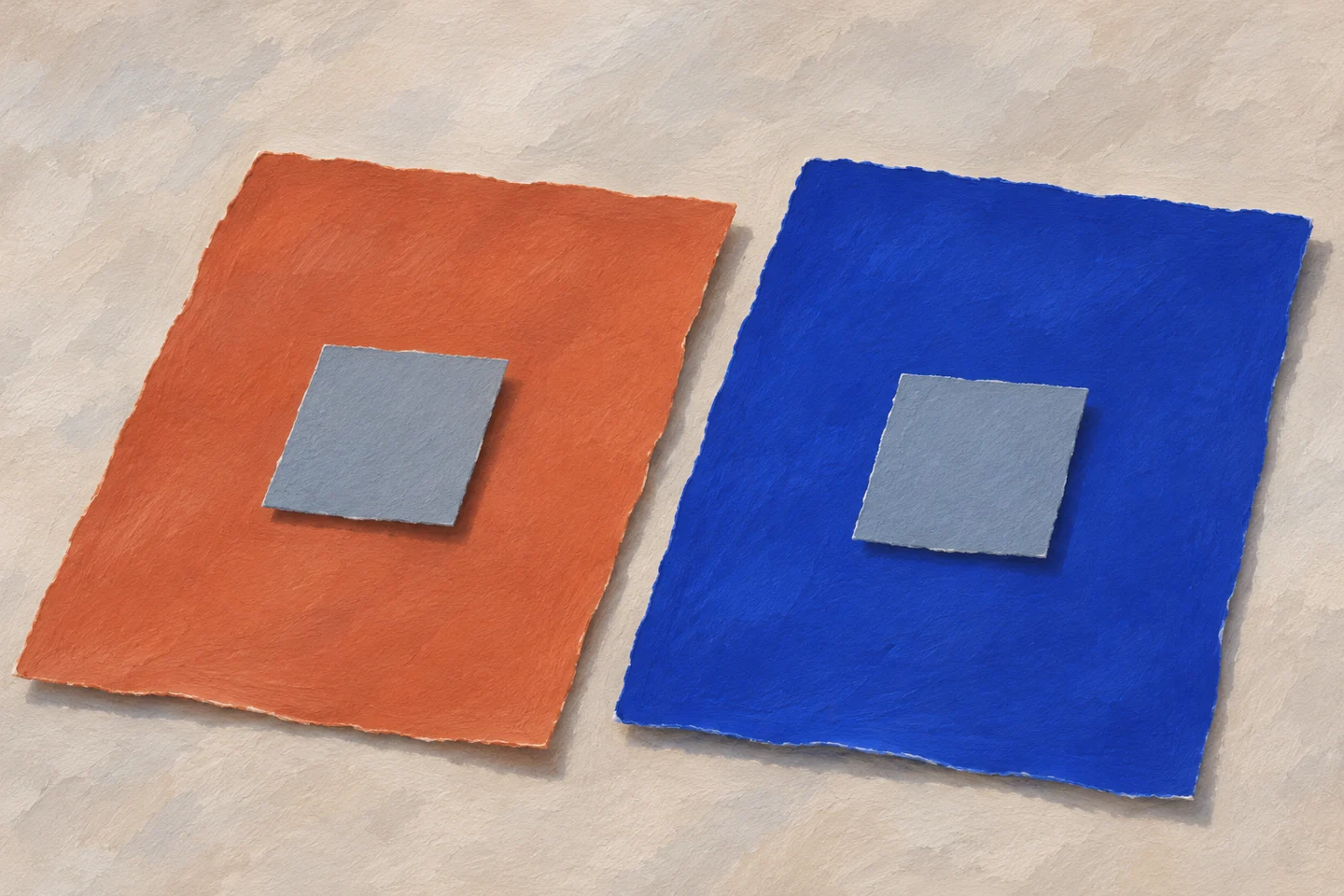
The small square seems cooler on one side, duller on the other. Before correcting it, it helps to bring the two samples together. If we put them on a common background, the difference that prompted us to intervene may diminish. The file has not changed its mind: we have changed the relationship in which we were looking at it.
This page begins with a choice that often returns in graphic work: taking an approved colour, placing it in a new composition and suddenly finding it out of place. The temptation is to adjust the sample. Yet its surroundings may be what needs attention.
Keeping something constant
I built a comparison with two equally sized squares of the same colour, #848b98. One sits on a warm light field, the other on blue. The control puts both on a neutral background and returns them to the original arrangement. The squares’ values remain identical in every state; the illustrations accompany the reasoning and do not certify colour equivalences.
Two samples, one value
Unchanged sample: #848b98. Only the background changes.
There is no need to persuade yourself that you see a difference. The effect may be more or less apparent depending on the screen, the room’s light and how you look. The controllable part is more modest: we know which value stayed fixed and which context we replaced. This at least lets us ask a precise question, instead of attributing every change in the composition to the square.
An identical sample does not guarantee an identical appearance. The code tells us that we preserved a numerical choice; on its own, it does not exhaust the experience of that colour beside others.
The neighbour enters the design
The Albers Foundation’s presentation of Interaction of Color describes work grounded in observing relationships between colours, culminating in the 1963 volume. Here I take up its practical question in a new composition: what happens to a sample when its surroundings change? I am neither reproducing a plate from the book nor turning an exercise into an experimental measurement.
That question shifts the work. A grey chosen in an isolated window can still be an incomplete decision. In the design, it must coexist with photographs, margins and areas of text; each proximity changes what stands out and what seems to recede. This is why I return to the sample within the page, instead of treating its code as a sufficient guarantee.
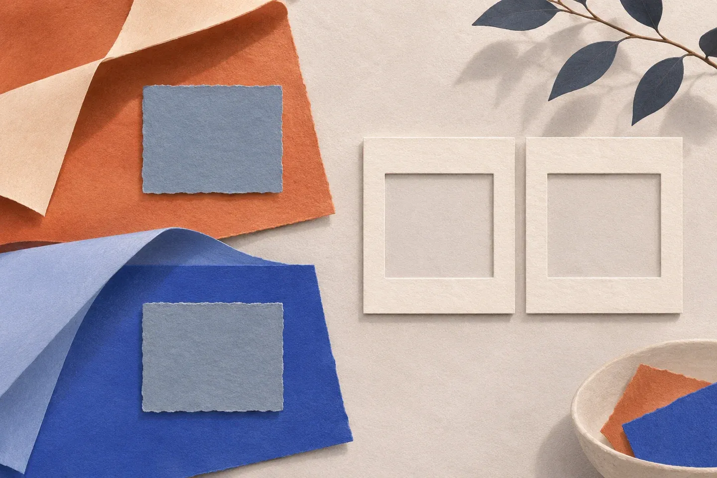
The common background is useful precisely because it temporarily removes a relationship. It does not establish the “true” colour under every condition. It lets us recognise that we were comparing two arrangements while thinking we were judging a single element.
A screen is not a sheet of paper
The papers in the illustrations are AI-generated: they give the question material form, but they are not photographs of a print test. This page’s exact comparison takes place on screen. Transferring its values to paper would require another assessment, declaring the stock, inks and lighting; photographing a monitor or sending the same numbers to a printer would not suffice.
A screenshot, too, mainly preserves an arrangement of pixels. Whoever opens it may encounter a different brightness from mine. This limit does not make digital work useless: it shows how narrowly we must frame a claim drawn from the comparison. I kept two values identical in the document, not the conditions of every future viewing.
Before correcting the square
When a colour looks wrong, I can begin by shifting my attention. Compare the sample on a common background, return it to the composition, observe which juxtaposition produces the distance I care about. If I then decide to change it, I will have a reason tied to the page rather than just its box in the palette.
Designing a colour includes designing its neighbours. The square remains small, almost negligible. The work we ask of it begins well before its edge and continues on the other side.